Categories: Network Events
11.17.2015
Please check out our NEW mobile optimization and design refresh.
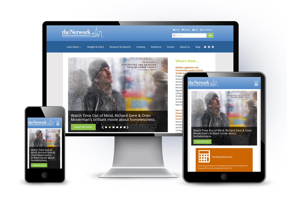
When our site was first designed, the iphone wasn’t a phenomenon – and so our site wasn’t designed with it in mind. Mobile optimization simply means that the view you see of our website depends upon what device you are using to access the site – it is ‘responsive’ i.e. it scales differently depending on whether you are on your mobile phone , tablet or desktop – and of course, this scaling makes the interface more user-friendly.
Over 30% of visitors to shnny.org come via smartphones and tablets, and this percentage is growing, so it was the right time for us to transition to a mobile-friendly site design.
Remember to refresh your browser (to see our new structure and design elements).
Some highlights in mobile: you’ll see that our homepage slides fill the screen and create a more powerful impact; when you scroll down beneath the homepage slide, you’ll see three newly featured areas “Funding Resources,” “Find Housing,” and “Network Newsfeed” – which have perennially been the most highly trafficked areas of our site, so it makes sense to make it easier for visitors to navigate there rapidly. The hamburger menu (the three little vertical lines) in the upper right corner offers the sub-navigation options as a drop down menu.
Your feedback is very welcome – please email your thoughts and notes about any changes you’d like to see to cstuart@shnny.org.
The Network enlisted Human Service Solutions (HSS) to create the site refresh and mobile optimization. Jason Summerfield, of HSS advises, "There are a few different approaches you can take in order to make a website mobile-friendly. In some cases, you may create a separate site specifically for mobile. But in the case of SHNNY, we took the increasingly popular approach of developing a single 'responsive' website that can scale across all devices - this approach makes maintenance much more efficient, rather than maintaining two separate sites."
And here’s a tip from Jason: If you're not sure whether or not your website is mobile-compatible, here is a link where you can check your site with Google's Mobile-Friendly Test. All you have to do is enter your website's URL and it will tell you whether or not it is mobile-friendly to Google's standards.
Many thanks to our fabulous design/tech team from HSS web development, Jason Summerfield and Mike Hessling, for their great work.